About the Project
- Main Purpose:
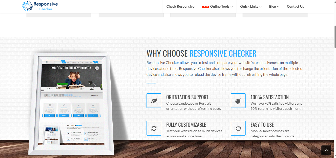
An online tool designed to check and ensure that your website is fully responsive across a range of mobile devices, helping you maintain a strong, effective online presence.
- Target Users:
- Website owners, developers, and designers
- Businesses aiming to optimize user experience on mobile platforms
- Digital marketers focused on improving engagement and SEO performance
- Key Features:
- Instant responsiveness check for each individual page of your website
- Compatibility analysis across a wide range of mobile devices—including iPads, smartphones, and tablets
- Clear diagnostic feedback with recommendations to improve mobile usability
- Core Benefits:
- Ensures your audience gets a seamless experience, no matter the device
- Helps retain visitors by reducing bounce rate and improving load performance
- Boosts engagement, re-visits, and ultimately enhances your digital reputation
- Why It Matters:
In today’s mobile-first world, a slow or non-responsive site can lose a visitor in seconds. When your competitor is just a swipe away, ensuring your design works perfectly on mobile is no longer optional—it’s essential.
- Results-Oriented:
- Quickly identifies and guides you to fix non-responsive design issues
- Improves clarity of message delivery, making it easier for users to connect with your brand
- Keeps your website accessible and functional—anytime, anywhere